
Throughout 2012, responsive web design was a hot topic ad continues to buzz in 2013. While this terms has eluded some, web designers and developers alike have adapted to this new forms of web design that’s here to stay.
So what does this term responsive web design really mean? In 2012, PC sales saw a serious decline in sales from 2011′s 352.8 million units to 348.7 million units. The cause of this decline in sales came from a consumer shift in the way they’re accessing the Internet. This shift was a direct result of the economic downturn forcing consumers to reevaluate their budgets for gidgets and gadgets. In response to this downturn the makers of these devices created faster smartphones, tablets, and the like.
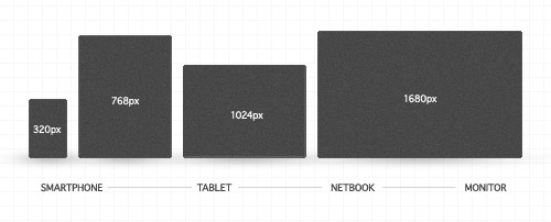
Tablet sales alone are projected to be over 100 million for 2012 and soon top notebook sales. With the rise of these new machines comes the need to build form their screens.
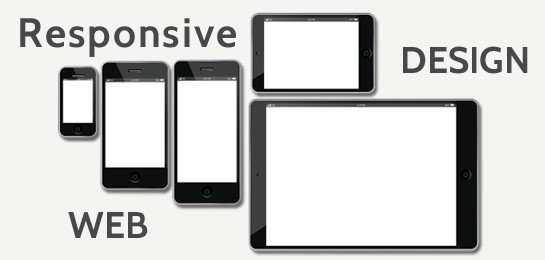
Enter Responsive Web Design
Simply put, responsive web design is web design that responds to the device it’s being seen on. Every device has it’s own screen resolution so media queries are sent to the device from the web code to determine it’s resolution so it knows how to size the design for the device.
Through the use of fluid grids and flexible images, responsive web design then resizes to fit that screen resolution. In addition to resizing, it also can detect the type of device and change the site’s behavior. Some would say this is adaptive design, but adaptive and responsive have kinda become interchangeable.
Great design is always born out of a functional need.
In this case, the functional need changed because the devices changed. PC’s, smartphones, notebooks, tables, and mini tablets all have different needs. With responsive web design, once you build it once, it works on any screen. Anyone building a website from this point on into the future cannot afford to ignore responsive web design.
For an example of responsive web design in action, open this article up on a desktop browser and slowly resize the browser to make it thinner. You should see all the page elements adjusting themselves automagically to fit the new width, going all the way down to the size of a mobile browser.
Hopefully this article helped, but if you’re still feeling confused about responsive design, don’t be afraid to leave a question or comment. If you’re already utilizing responsive web design in your site or web application, share the link here so we can see!
About Reico
Reico is the owner and team member of The Applied VIsual, website design and development company. He is also available on Twitter @AppliedVisual
- Find more about me on:


JAN
2013