

Here is the brand problem that should have been impossible to solve.
One tournament. Three countries. Sixteen cities. Dozens of languages. Hundreds of millions of local fans who each believe their city is the real center of the event. And a global brand that has to feel simultaneously universal and deeply, specifically local in every single one of those sixteen places at the same time.
The FIFA World Cup 26™ host city brand system solved that problem, and the way it solved it is one of the most instructive brand architecture decisions of the decade. Not just for global organizations. For any business that serves more than one audience, operates in more than one market, or has ever struggled to feel specific and personal at scale.
Here is what the FIFA World Cup did, why it works, and what your business can steal from it today.
The FIFA World Cup Host City System Starts With a Non-Negotiable Core
The first decision the FIFA World Cup 26™ brand system makes is the most important one: certain elements never move.
The master emblem. The official wordmark. The trophy silhouette. The typographic system. These are locked. Everywhere. Always. No host city, no local committee, no sponsor activation gets to touch the foundational elements of the FIFA World Cup identity regardless of local preference, cultural context, or political pressure.
This sounds obvious. It almost never happens in practice.
Most brands that attempt local adaptation end up with what designers call brand drift, the slow erosion of the core identity as local markets make small adjustments that each seem reasonable in isolation but collectively destroy the coherence of the whole system. One market changes the font slightly. Another adjusts the primary color for local printing. A third adds a local element that crowds the mark. Three years later the brand looks like sixteen different companies operating under the same name.
The FIFA World Cup prevents this by establishing an absolute non-negotiable core before any local expression is permitted. The foundation is sacred. Everything built on top of it is free to flex.
The takeaway: Before your business attempts to serve multiple audiences or markets, define the elements of your brand that are completely non-negotiable. Not guidelines. Non-negotiables. The things that never change regardless of context. Without that foundation, every attempt at flexibility becomes drift.
How the FIFA World Cup Makes Every City Feel Like the Center of the World
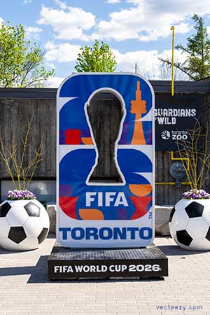
Once the non-negotiable core is established, the FIFA World Cup host city system does something elegant: it gives each city its own dedicated color palette, its own pattern system, and its own visual language, all developed from local cultural reference points specific to that city’s identity.
Atlanta’s visual system does not look like Seattle’s. Miami does not look like Toronto. Mexico City does not look like Kansas City. Each one is unmistakably local, drawing on the specific colors, textures, patterns, and visual culture of that place, while every one of them is unmistakably FIFA World Cup.
This is the hardest thing to do in brand architecture. Global coherence and local specificity are almost always in tension. Most brands resolve that tension by choosing one or the other, either enforcing global uniformity at the cost of feeling generic everywhere, or allowing local flexibility at the cost of losing coherence across the system.
The FIFA World Cup 26™ found the third option: a system flexible enough to feel genuinely local in sixteen different cities while rigid enough to feel like one brand across all of them. That balance is not achieved through compromise. It is achieved through architecture, a clear structural hierarchy that defines exactly what is fixed, what is flexible, and what the relationship between the two must always be.
The takeaway: If your business serves multiple audience segments, different industries, demographics, geographies, or use cases, you do not have to choose between a message that is broad enough to reach everyone and specific enough to resonate with anyone. You need a brand architecture that defines what is fixed across all audiences and what is permitted to flex for each one.
The FIFA World Cup Host City Logos Teach the Most Important Lesson in Brand Consistency
Look at the sixteen FIFA World Cup 26™ host city logos side by side and something becomes clear that is not obvious when you look at them individually: the variation between them is enormous, but they are instantly recognizable as a family.
That family resemblance does not come from the colors, those vary dramatically. It does not come from the patterns, those are unique to each city. It comes from the structural logic that underlies every mark in the system: the same proportional relationship between elements, the same typographic hierarchy, the same spatial logic that governs how the local and global elements relate to each other.
This is what brand consistency actually means, and it is almost universally misunderstood.
Most businesses treat consistency as repetition: use the same colors, the same fonts, the same logo, everywhere, always, without variation. That is not consistency. That is rigidity, and rigidity does not scale. It breaks the moment a new context, a new format, or a new audience requires anything to change.
Real consistency is structural. It is the underlying logic that makes every expression of the brand feel like it came from the same place, even when the surface-level elements look different. The FIFA World Cup host city system has that structural consistency in abundance, which is why it can look dramatically different in sixteen cities and still feel like one brand.
The takeaway: Audit your brand for structural consistency rather than surface consistency. Do your touch points share the same underlying logic, proportions, hierarchy, spatial relationships, even when the specific elements vary? If the answer is no, you do not have a consistent brand. You have a consistent color palette, which is not the same thing.
What the FIFA World Cup Figured Out About Belonging
 There is a psychological dimension to the host city brand system that goes beyond design strategy, and it is the most powerful thing the FIFA World Cup 26™ has done with its visual identity.
By giving each host city its own dedicated visual identity within the FIFA World Cup system, the brand is doing something specific and deliberate: it is making local fans feel like the tournament belongs to them specifically, not just to the world generally.
Belonging is one of the most powerful purchase and engagement triggers in human psychology. When a person feels that something is specifically for them, not just generally available to everyone, their emotional investment increases dramatically. They are more likely to attend. More likely to buy. More likely to tell other people. More likely to feel that their participation matters.
The FIFA World Cup host city brand system manufactures that feeling of specific belonging at scale, sixteen times over, simultaneously, across three countries, without diluting the global identity that makes the event worth belonging to in the first place.
That is not a design achievement. That is a psychological achievement executed through design.
The takeaway: Does your brand make your specific customer feel like it was built for them, or does it feel like it was built for everyone, which is functionally the same as being built for no one? Specificity creates belonging. Belonging creates conversion. The FIFA World Cup understands this at a billion-dollar scale. Your business can apply it at any scale.
The Final Lesson the FIFA World Cup Series Has Been Building To
This is the fifth article in a series that started with a simple observation: the FIFA World Cup converts five billion people, and most small business websites cannot convert a stranger.
Across five pieces we have looked at conversion architecture, heritage branding, trophy-as-identity, color psychology, and now host city brand systems. Every piece has pointed at the same underlying truth from a different angle.
The FIFA World Cup does not succeed because it has more money, more talent, or more resources than any brand your business will ever compete against. It succeeds because every decision, visual, strategic, psychological, is made in service of one outcome: guiding the undecided person toward yes.
Your business has that same opportunity. The gap between where you are and where the FIFA World Cup brand operates is not a resources gap. It is a clarity gap.
And clarity gaps can be closed.
The Clarity Sprint Was Built to Close That Gap In 48 Hours
The Applied Visual’s Clarity Sprint is a structured conversion analysis that identifies exactly where your business is losing customers before they decide, and delivers a specific, word-for-word plan to fix it within 48 hours.
Not a generic audit. Not a marketing checklist. A complete diagnosis of your business, your audience, and your conversion breakdown, built around your specific situation and delivered ready to execute.

About Reico
Reico is the owner and team member of The Applied VIsual, website design and development company. He is also available on Twitter @AppliedVisual
- Find more about me on:


JUL
2026