
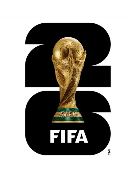
Look at the FIFA World Cup 26 official emblem for more than a second and something becomes obvious: it is not decoration. It is compression.
A single mark holds the number of the tournament, the silhouette of the most famous trophy in sport, and almost a century of accumulated meaning, all legible at a glance, all recognizable at the size of a thumbnail on a phone screen.
That is an extraordinarily difficult design problem. Most brands never attempt to solve it. They settle for a wordmark and a color palette and call it an identity.
The emblem is a useful case study, not because a small business needs a hundred years of history to justify good design, but because the *thinking* behind it applies at any scale. Here is what it teaches about building a brand with staying power.
1. Heritage Is Not Decoration. It Is Trust You Don’t Have to Re-Earn.
The trophy at the center of the emblem is not there because it looks good, though it does. It is there because that object has carried meaning across generations of viewers who have never met each other, speak different languages, and live on different continents. The shape alone does work that no tagline could ever do.
That is what heritage actually buys a brand: trust that does not need to be re-explained every time someone encounters it.
Most small businesses have some version of this and underuse it. A decade in business. A specific result repeated hundreds of times. A founder story that explains “why” the business exists, not just “what” it sells. These are not nostalgia. They are trust assets and trust assets reduce the amount of convincing a brand has to do in every single interaction.
Takeaway: Audit what your business has accumulated that a brand-new competitor could not simply copy. That is your heritage, however small. It belongs in your brand, not buried in an About page no one reads.
2. A Mark That Lasts Is Built for Reduction, Not Addition
 When design is complete, you can remove elements or add them without disturbing compositional balance. It’s not that you are forcing images, shapes, and text to look good together, you’re balancing those items inside of it’s viewing space. The viewing space could be a website, social media post, outdoor sign, or an article of clothing.
Strip away every other element of the World Cup emblem and the trophy silhouette still reads instantly. That is the test heritage branding has to pass: can the symbol survive being reduced to almost nothing and still communicate?
This is the opposite instinct of most small business branding, which tends to add a tagline here, a badge there, a few more colors to feel “complete.” Every addition is a new thing the viewer has to process before they understand what they are looking at. Every one of those additional seconds is a place where attention can leak away.
The strongest brand marks are not the most elaborate. They are the most reducible. They survive being small, being black and white, being seen for half a second on a phone screen between two other things competing for the same attention.
Takeaway: Take your logo and shrink it to the size of a favicon. If it stops working, the problem is not the size. The problem is that the mark was never actually simple, it just looked simple at full scale.
3. Legacy Brands Update the Frame, Not the Foundation
Each World Cup emblem changes. The numerals shift, the color treatment evolves, the surrounding visual language adapts to the host nations and the era. But the foundational idea, trophy plus tournament number, instantly legible as one mark, never moves. That continuity is what lets the brand feel both current and permanent at the same time.
This is the part small businesses get backwards most often. They either freeze their identity entirely, refusing to update anything for fear of losing what little recognition they have built, or they overhaul the whole thing every year chasing a trend, severing the very recognition they were trying to protect.
The brands that compound trust over time do neither. They identify the one or two elements that are actually doing the recognition work, a mark, a color, a specific phrase, and they protect those while everything else around them is free to evolve.
Takeaway: Decide which one or two elements of your brand are non-negotiable. Protect those completely. Let everything else flex as your business grows.
4. The Most Confident Brands Explain the Least
Nowhere in the World Cup emblem is there a sentence explaining what the FIFA World Cup is or why it matters. The mark assumes the weight of its own history and lets the viewer’s existing knowledge do the rest of the work.
That confidence is a deliberate design choice, not an accident of scale. A brand that has to explain its own significance every time it appears is signaling, underneath the explanation, that it is not sure the significance will be felt otherwise.
Small businesses without decades of accumulated recognition often overcorrect into over-explaining, long taglines, paragraphs of justification on the homepage, logos crowded with descriptive text. Every bit of that over-explanation is the brand quietly admitting it does not trust its own mark to carry weight.
Takeaway: Look at your most prominent brand touchpoint, your logo, your homepage hero, your storefront sign. How much of it is explaining versus simply being? The ratio tells you how much confidence the brand actually has in itself.
5. Heritage Branding Is a Compounding Asset If You Protect It
The reason FIFA treats its emblem, wordmark, and typeface with such aggressive protection is not vanity. FIFA’s Rights Holders only invest in the Tournament if they are provided with exclusivity for the use of the official marks and other commercial rights, and without that protection, the acquired rights would be significantly diminished in value.
Translated for a business of any size: an identity that is diluted, copied, or inconsistently presented stops compounding. Recognition is not free to rebuild once it has been blurred. Every off-brand version of your logo, every inconsistent color, every place your name shows up looking like a slightly different company, all of it is value leaking out of an asset that should be appreciating, not eroding.
Takeaway: Treat your visual identity the way a much larger brand would, as a protected asset with rules, not a flexible style that changes depending on who is making the graphic that week.
What This Means for Your Business
A small business does not need ninety-six years of history to build heritage branding. It needs to identify what it has already earned, a track record, a result, a specific story, and then build a mark disciplined enough to carry that weight without explaining itself into the ground.
Most businesses are not failing to convert because their offer is weak. They are failing because their brand has never been given the chance to compound. It changes every year. It explains too much. It adds instead of reduces. And every one of those habits resets the trust clock back to zero.
The Clarity Sprint Finds Where Your Brand Is Leaking Trust
The Applied Visual’s Clarity Sprint identifies exactly where your messaging, visuals, and decision flow are breaking down before a customer decides, and delivers a specific plan to fix it within 48 hours.
About Reico
Reico is the owner and team member of The Applied VIsual, website design and development company. He is also available on Twitter @AppliedVisual
- Find more about me on:


JUN
2026