
Most tournament logos play it safe. A shield. A ball. A trophy floating in the middle of a busy crest, surrounded by stars and ribbons and a dozen other elements all competing for the same six square inches.
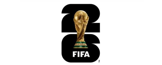
The FIFA World Cup 26™ emblem does the opposite, and it is the boldest thing a logo of this scale has done in years. It strips away almost everything, and lets what’s not there do the talking.
The Genius Is in What They Removed
Look at the emblem and the first thing your eye does is complete a shape that isn’t fully drawn. The trophy sits inside the negative space of the tournament numerals, which means your brain is doing active work to perceive it, and that small cognitive effort is exactly why the mark sticks.
This is the hardest kind of design to execute and the easiest kind to get wrong. Negative space logos either land as quietly brilliant or completely unreadable, and there is almost no room in between. FIFA’s design team threaded a needle that most agencies would never attempt at this scale, on this stage, with this much riding on it.
A shield-and-ribbon crest is safe. Nobody gets fired for a shield-and-ribbon crest. What FIFA shipped instead is a mark that trusts the viewer’s eye to do something active, and that trust is what makes it feel modern instead of decorative.
Clean Is a Choice, Not a Default
There is a common myth in design that “clean” means simple, and “simple” means easy. The World Cup 26 emblem proves the opposite. Every element that isn’t there had to be deliberately removed, tested, and defended in a room full of stakeholders who all wanted to add one more thing.
That restraint is the actual genius. Anyone can add a flourish. Almost no one can hold the line on subtraction when there is pressure, commercial, cultural, political, to put more into the mark. A three-country, forty-eight-team, hundred-plus-match tournament had every incentive to cram. The design team didn’t.
The result reads instantly at the size of a phone icon and holds up at the size of a stadium banner. That kind of scalability is not an accident of minimalism. It’s the payoff of a hundred small fights over what to leave out.
Why This Is a 2026 Design, Not a 1994 Design
Place the World Cup 26 emblem next to tournament logos from twenty or thirty years ago and the generational shift is obvious. Older marks lean on literal imagery, a ball, a map, a stadium silhouette, rendered in full color with gradients and shadows trying to look three-dimensional on a flat surface.
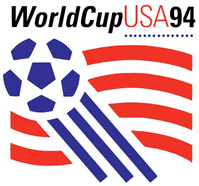 The 2026 mark does the opposite of all of that. Flat. Two-tone. Built on geometry and negative space rather than illustration. It belongs on a phone screen as comfortably as it belongs on a flag, which is exactly the design problem a modern global brand actually has to solve, most of its impressions will happen on a six-inch screen, not a forty-foot banner.
This is what a logo built for 2026 looks like instead of a logo that happens to be unveiled in 2026. The difference is not subtle once you see it.
The Lesson Underneath the Spectacle
It is tempting to write this off as something only a billion-dollar global brand can pull off, that small businesses don’t have the budget or the cultural permission to be this bold.
That’s backwards. Budget had almost nothing to do with what makes this mark work. The genius is entirely in the thinking, the willingness to remove instead of add, to trust negative space instead of filling it, to make something legible at a thumbnail and powerful at a billboard.
That thinking is free. Most businesses just never apply it, because the instinct under pressure is always to add one more thing, one more line of copy, one more badge of credibility, one more reassurance, instead of trusting the customer to complete the picture themselves.
Clarity Is the Whole Point
The reason this logo works is the same reason great conversion systems work: it removes everything that isn’t doing a job, and it trusts the audience to fill in the rest.
That is precisely the gap most businesses are sitting on. Not a lack of ideas. A lack of restraint. Too much explanation, too many competing messages, no negative space anywhere in the brand for the customer’s own attention to do some of the work.
The Clarity Sprint Finds That Gap in Your Business
The Applied Visual’s Clarity Sprint identifies exactly where your messaging and visuals are doing too much explaining and not enough converting, and delivers a specific plan to fix it within 48 hours.

About Reico
Reico is the owner and team member of The Applied VIsual, website design and development company. He is also available on Twitter @AppliedVisual
- Find more about me on:


JUL
2026