

You felt something before you knew what you were looking at.
That is not an accident. That is the FIFA World Cup color system doing exactly what it was designed to do, trigger an emotional state before the rational brain has time to evaluate whether the emotional state is warranted.
The FIFA World Cup 26™ brand uses color the way a film score uses music: not to decorate the experience, but to control how the experience feels before a single conscious thought is formed. Most people will never notice it is happening. That invisibility is the entire point, and it is one of the most sophisticated applications of color psychology at scale that commercial branding has ever attempted.
Here is how it works, why it works, and what your business can take from it.
How the FIFA World Cup Uses Color to Trigger Emotion Before Thought
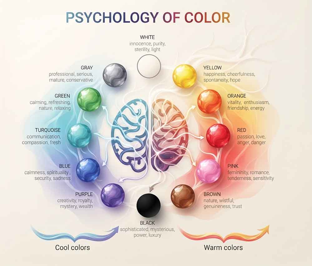
Color psychology is not a soft science or a designer’s preference. It is a documented neurological phenomenon. The human brain processes color in the limbic system, the part responsible for emotion, memory, and motivation, before the information reaches the prefrontal cortex where rational evaluation happens.
In practical terms this means the FIFA World Cup brand has already made you feel something before you have decided how you feel about it. The warm, saturated color palette of the FIFA World Cup 26™ visual system is not chosen because it looks good on a banner. It is chosen because those specific frequencies of color trigger specific emotional responses in the human brain, excitement, warmth, energy, belonging, that make the viewer more receptive to everything that follows.
This is color used as infrastructure, not decoration. And the gap between those two uses is the gap between a brand that converts and one that simply exists.
The takeaway: Your brand colors are either triggering the emotional state that precedes a purchase decision or they are not. There is no neutral. Every color choice is either working for your conversion system or against it.
The FIFA World Cup 26 Color System Is Built for Three Countries and Five Billion People
The FIFA World Cup 26™ brand has to work across Canada, Mexico, and the United States, three countries with different cultural color associations, different visual languages, and different emotional responses to the same hues.
This is an almost impossibly complex color problem. A color that signals celebration in one culture signals danger in another. A palette that reads as energetic in one market reads as aggressive in the next. And all of it has to resolve into a single coherent visual system that feels right everywhere at the same time.
The FIFA World Cup solved this by anchoring the palette in colors with near-universal emotional associations, the warm end of the spectrum where energy, excitement, and optimism live regardless of cultural context, while allowing the host city visual system to flex locally within that anchor.
The result is a brand that feels simultaneously global and local, universal and specific. Every host city gets its own color expression. The FIFA World Cup master palette holds them all together.
The takeaway: If your business serves more than one audience segment, your color system is either unifying them or fragmenting them. A palette that works for one audience while alienating another is not a brand, it is a targeting problem disguised as a design problem.
Why FIFA World Cup Colors Feel Different Inside a Stadium
There is a phenomenon in environmental psychology called chromatic adaptation, the way color perception shifts based on the surrounding environment, lighting conditions, and the emotional state of the viewer.
The FIFA World Cup brand accounts for this in a way most brands never consider. The colors that appear on a broadcast graphic are calibrated differently from the colors that appear on in-stadium signage, which are calibrated differently again from the colors that appear on merchandise and digital applications.
Most brands treat color as a fixed value, a hex code, a Pantone number, and apply it identically everywhere. The FIFA World Cup treats color as a dynamic system that has to be tuned to the environment it appears in, because the same color will produce a different emotional response under stadium floodlights than it does on a phone screen at 11pm.
This level of color discipline is rare because it is expensive and difficult to maintain. But the emotional payoff, a brand that feels consistent and intentional in every environment, is what separates brands that feel premium from brands that feel inconsistent without the viewer being able to explain why.
The takeaway: Where does your brand’s color appear? Website, print, signage, social media, packaging, uniforms? Are those colors calibrated for each environment or applied identically everywhere? Inconsistent color across environments is one of the most common and least diagnosed trust leaks in small business branding.
 The Color Nobody Talks About Is Doing the Most Work
The most powerful color decision in the FIFA World Cup 26™ visual system is not the most saturated one. It is the negative space, the deliberate use of white and near-white that gives every other color in the system room to breathe and hit harder.
High-saturation color against insufficient negative space cancels itself out. The eye has nowhere to rest, no contrast to anchor the dominant hue against, and the emotional impact flattens. This is why brands that try to use bold color often end up looking chaotic rather than powerful, they have the right colors but the wrong ratio.
The FIFA World Cup palette works because it is not all color. The restraint is structural. Every saturated element earns its impact from the space around it, and that space is as deliberately designed as the color itself.
The takeaway: Look at your brand’s color usage and ask honestly: is there enough negative space for the color to land? If every element is competing at the same intensity, nothing is winning. Restraint is not timidity in color design, it is the mechanism that makes bold color actually bold.
What the FIFA World Cup Knows About Color That Your Business Probably Doesn’t
Color is not a preference. It is not a personality. It is not something you pick because it feels right or because your favorite brand uses something similar.
Color is a conversion lever. In the context of a brand, it is the first signal a customer receives, before they read a word, before they evaluate an offer, before they form a conscious opinion about whether your business is credible. And that first signal either predisposes them toward trust and engagement or it predisposes them toward skepticism and disengagement.
The FIFA World Cup understands this at a level most brands never reach because most brands never invest in understanding what their color system is actually communicating to the people it is supposed to convert. They pick colors they like. They match them to a mood board. They call it a brand.
The difference between a color system built on psychology and a color system built on preference is the difference between a brand that creates a feeling and a brand that hopes one happens.
Your Colors Are Either Converting or Costing You
Every day your brand appears in front of potential customers, the color system is making a first impression before anything else has the chance to. That impression is either building the emotional precondition for a purchase decision or it is undermining it, and most business owners have never diagnosed which one is happening.
The gap between a color system that converts and one that costs you is not always visible to the untrained eye. But it shows up in the data, in the bounce rate, the time on page, the conversion rate, the leads that go quiet after seeing the website for the first time.
The Clarity Sprint Diagnoses What Your Brand Is Communicating Before a Word Is Read
The Applied Visual’s Clarity Sprint identifies exactly where your visual system, messaging, and decision flow are breaking down before a customer decides, including the color and visual signals that are undermining trust before the conversion conversation even begins.

About Reico
Reico is the owner and team member of The Applied VIsual, website design and development company. He is also available on Twitter @AppliedVisual
- Find more about me on:


JUN
2026